Fitness Dashboard: Prioritization & Editing Behaviors
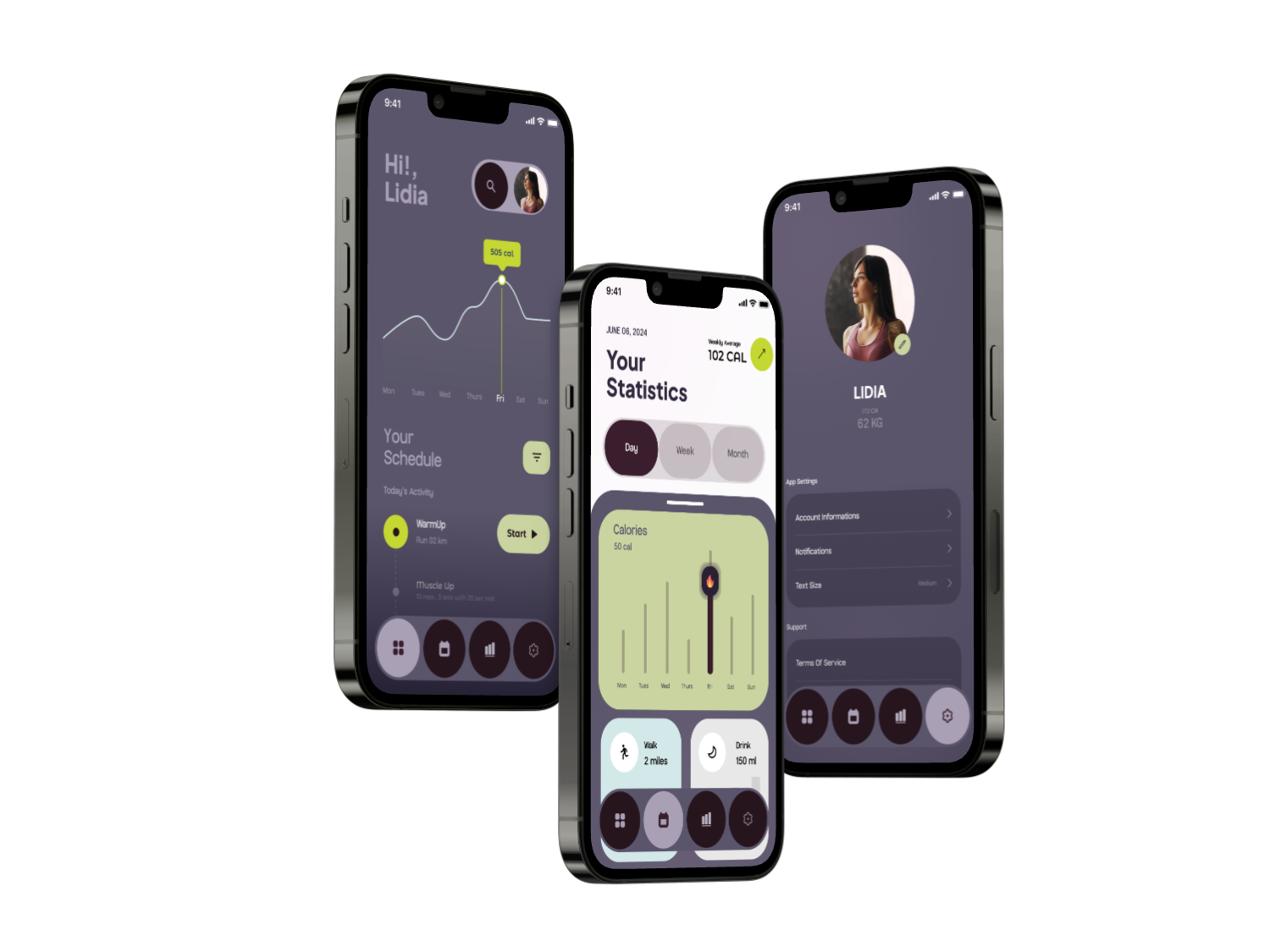
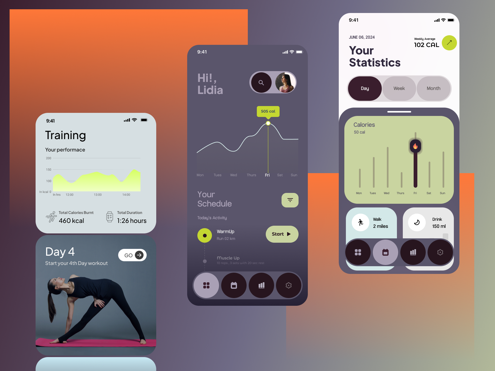
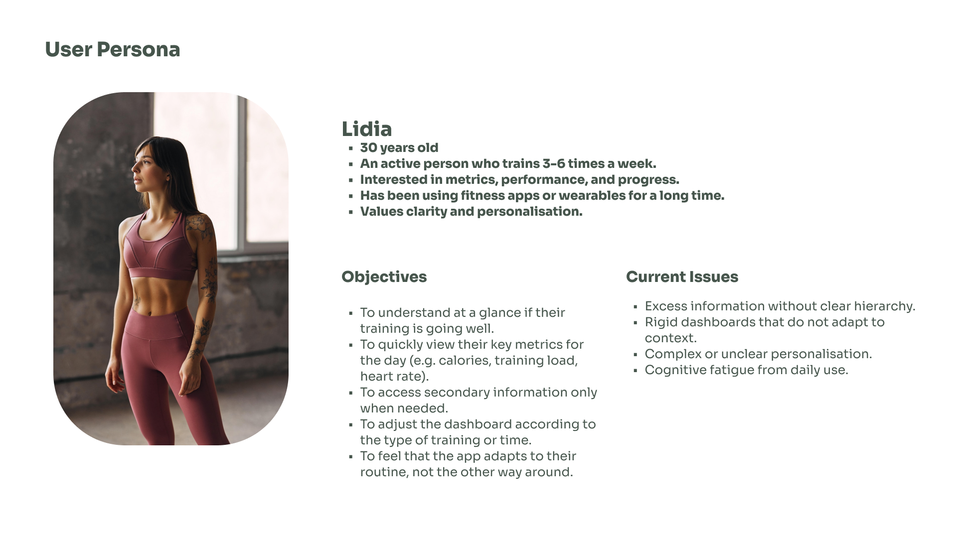
This project explores how active users interact with a fitness app dashboard, focusing on how information hierarchy and customization impact daily use. The app is designed for people who train several times a week and want to understand their progress at a glance, without unnecessary friction.
The Challenge
Fitness apps often present too much information with little hierarchy, forcing users to interpret data every time they open the app.
The key challenge was to find the right balance between:
Clarity vs. flexibility
Customization vs. cognitive load
Power features vs. discoverability
My role
I led the UX research and interaction design for this project, owning the end-to-end process from problem framing to design decisions.
I was responsible for:
UX research strategy and planning
Usability testing (exploratory + comparative)
Qualitative analysis and insight synthesis
Information hierarchy and dashboard logic
Interaction design decisions based on research
Validation of design trade-offs
This project required balancing user needs, product constraints and long-term usability, especially in a data-dense context.

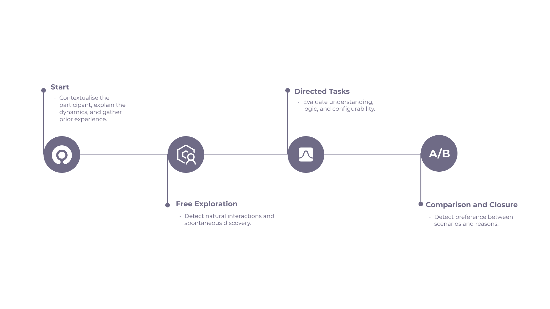
Methodology
-
Explorative Studies
- Usability testing with an A/B comparison
- Exploratory tasks and guided configuration tasks
- Qualitative insights supported by behavioral metrics
Participants: active users with experience using fitness or tracking apps
-
Journey Mapping
Visualize pain points and opportunities. Customer Journey Map Mapping the end-to-end experience from browsing to post-purchase to identify pain points like unclear sizing guides or misleading product photos.
Workflow and insights
Design Decision
Based on research findings, hidden gestures were replaced with explicit entry points to customization.
A visible “Edit dashboard” action and a clear edit mode improved:
Discoverability
User confidence
Perceived control
while reducing accidental interactions and cognitive load.
Outcome
The final approach prioritizes:
A clear information hierarchy
Optional, intentional customization
A stable default experience with flexibility when needed
This case demonstrates how small interaction decisions can significantly impact trust, usability, and long-term adoption in data-heavy fitness apps.