Designing clarity in high-trust financial decisions
Reducing decision fatigue in a banking product catalog
Retail banking product pages are high-stakes decision environments. Users need to understand complex offers, compare options, and feel confident before taking action — often within just a few minutes and usually on mobile.
This case explores how to redesign the “Accounts & Cards” section of a retail banking platform to reduce cognitive load, improve comparability, and guide users toward a clear next step, without sacrificing transparency or trust.
Challenge
The existing experience required users to:
Read and remember information in order to compare products
Navigate between multiple views to understand differences
Interpret unclear CTAs and next steps
Search for critical conditions (fees, requirements, eligibility)
This resulted in decision fatigue, increased uncertainty, and delayed or abandoned actions.
The challenge was not visual polish, but helping users make a confident decision faster in a regulated, high-risk context.
My role
Role: Strategic UX Research & Experience Design
Scope: Discovery, problem framing, UX strategy, information architecture, interaction design
Context: Retail banking · Regulated environment
I led the process end-to-end, from research synthesis and strategic framing to design decisions and validation planning.

Research & problem framing
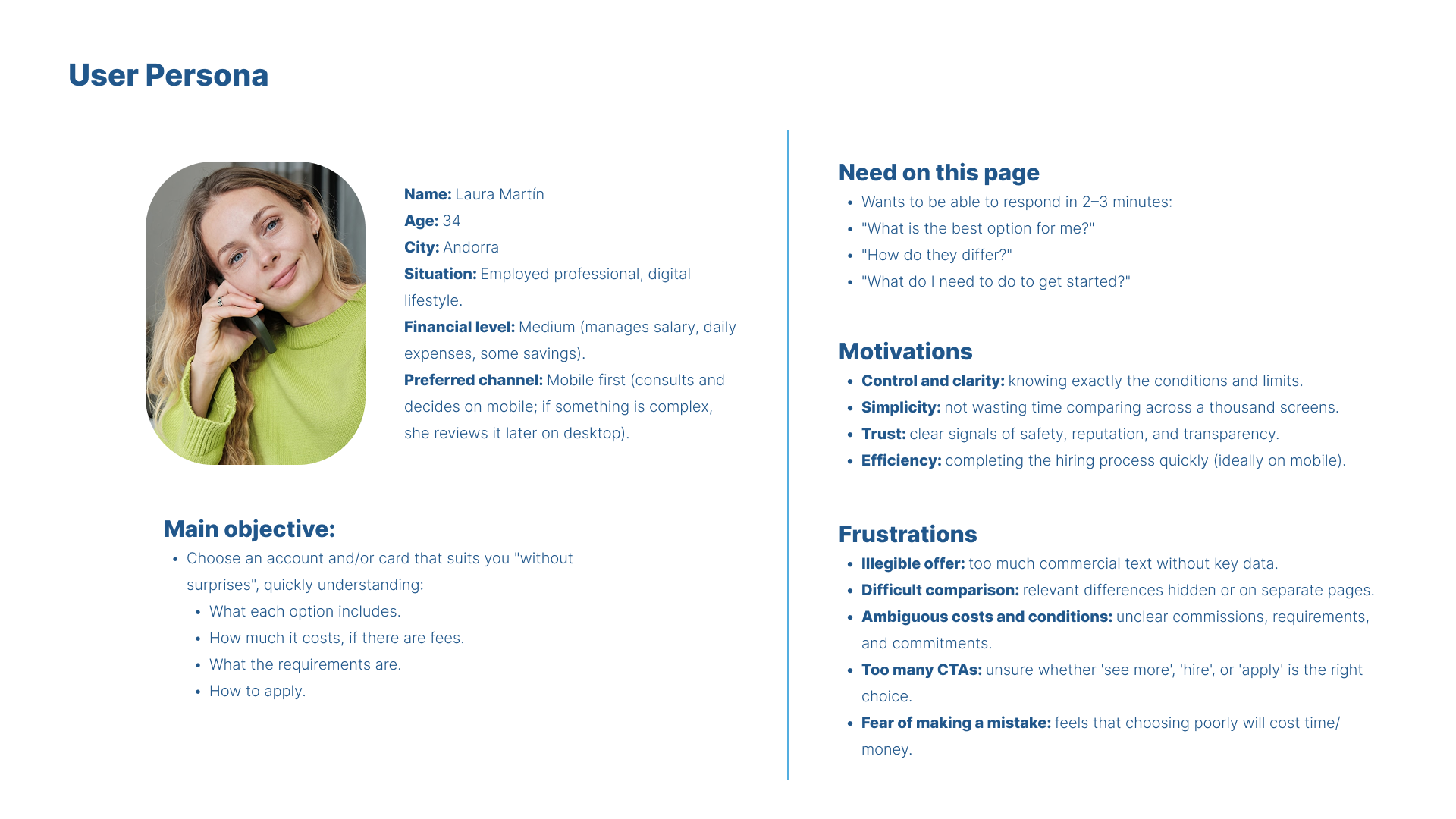
Key user need:
Users want to answer three questions quickly:
Which option is right for me?
How is it different from the others?
What do I need to do next?
Insights
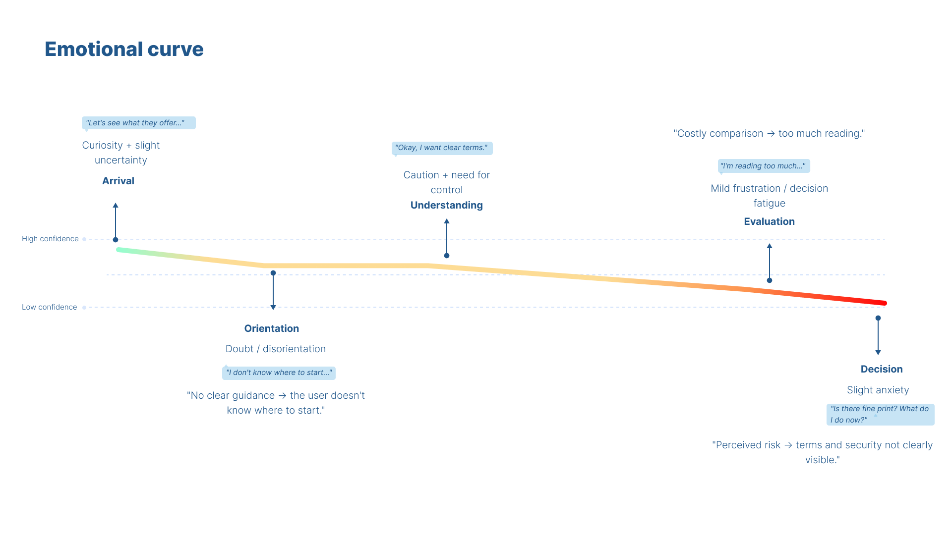
Research synthesis (persona, journey mapping, emotional curve analysis) highlighted three critical moments of friction:
Orientation: Users feel unsure about where to start and what to look at first
Comparison: Too much reading and inconsistent structures increase mental effort
Decision: Missing or hidden conditions increase perceived risk right before conversion
In banking contexts, clarity and confidence outweigh marketing language.
Strategic insights
From the research, several principles emerged:
Users scan first — structure matters more than copy
Comparison should rely on recognition, not memory
Reducing perceived risk is essential before asking for action
Too many CTAs dilute confidence instead of increasing choice
These insights directly informed the experience strategy.
Design principles
Recognition over recall
Users should compare options at a glance without memorizing details.One clear decision path
A dominant primary journey reduces hesitation and cognitive load.Progressive disclosure
Show what’s essential first, reveal detail only when needed.Confidence before conversion
Conditions, requirements, and reassurance must appear before the action.
Methods applied
-

Explorative Studies
Uncover user needs and behaviors. Interviewing customers who returned items to understand their expectations, frustrations, and decision-making process during purchase.
-

Quantitative Methods
Validate insights with data. Return Rate Analysis. Analyzing return data segmented by product type, size, and user profile to identify patterns and validate hypotheses about sizing or quality issues.
-

Journey Mapping
Visualize pain points and opportunities. Customer Journey Map Mapping the end-to-end experience from browsing to post-purchase to identify pain points like unclear sizing guides or misleading product photos.
-

Workshops
Co-creation Workshop with Users and Designers. Bringing together frequent returners and the design team to ideate improvements in product presentation, sizing tools, and post-purchase communication.
Solution overview
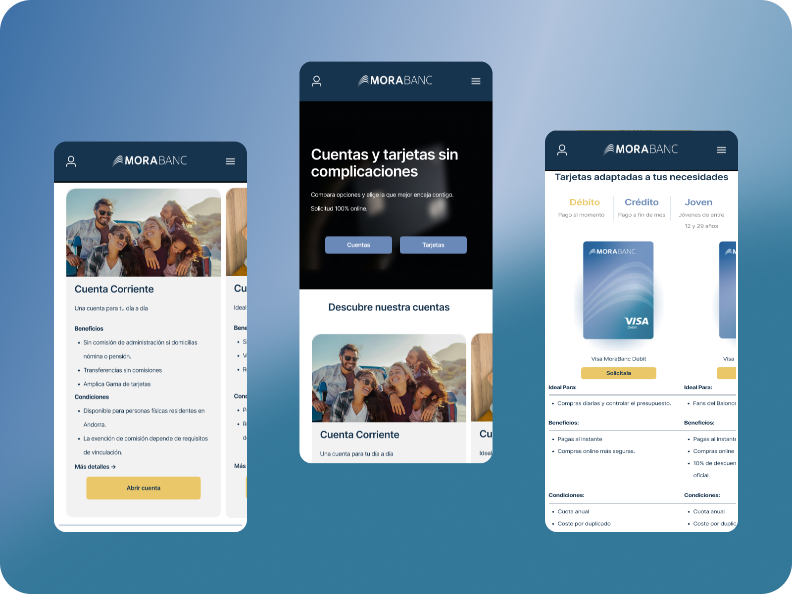
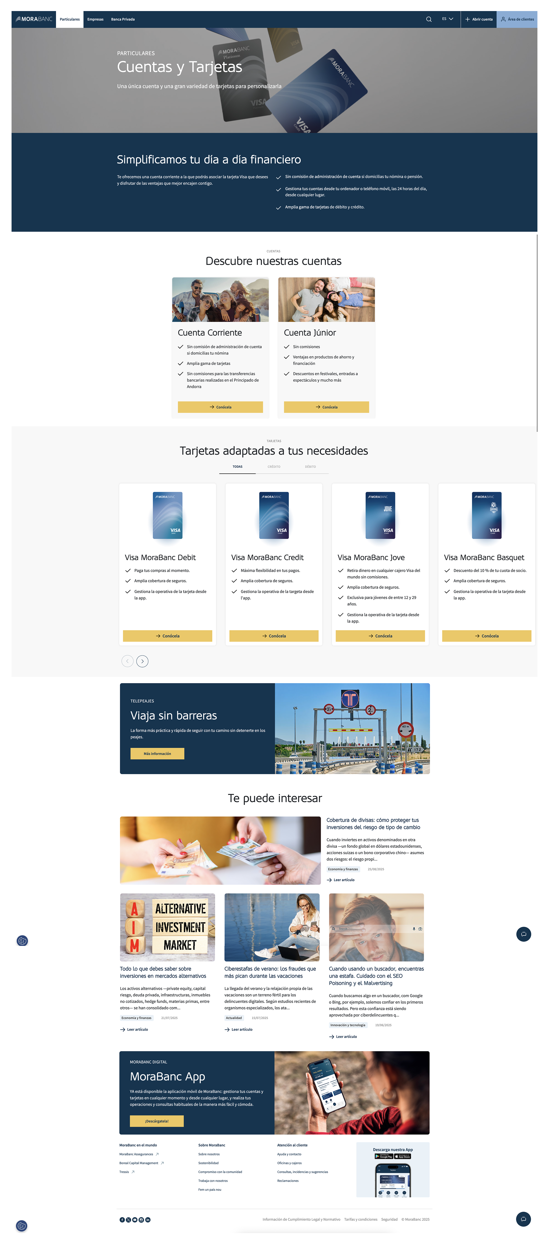
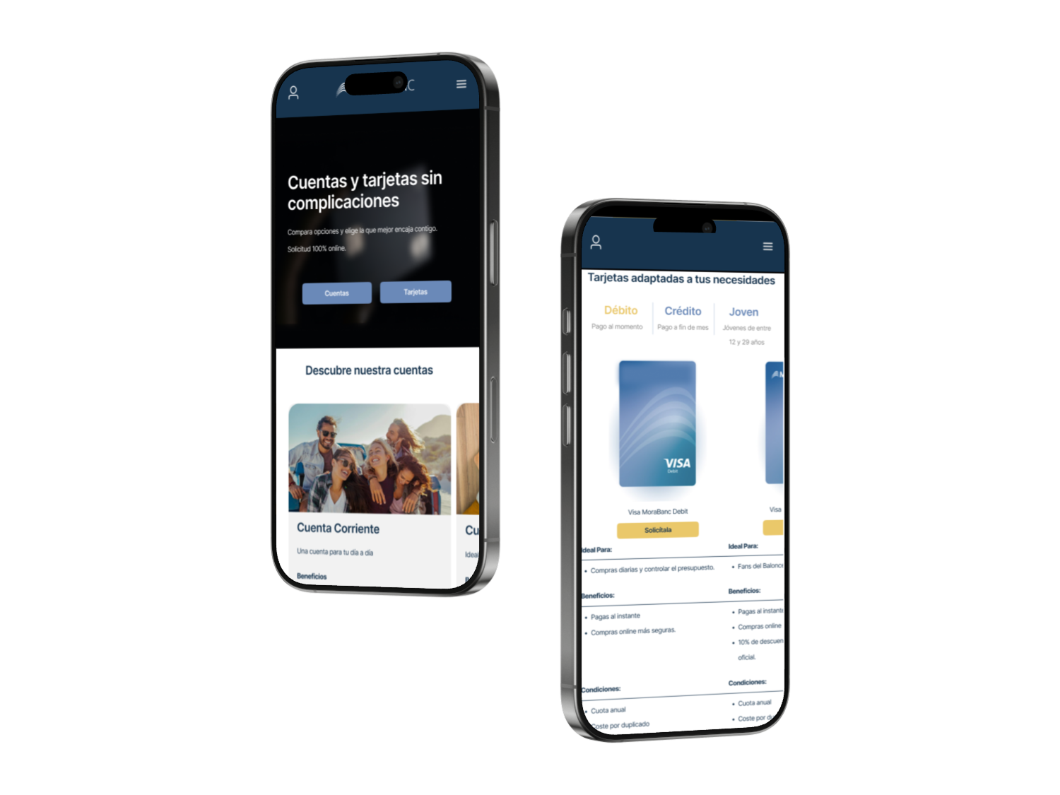
Clear structure & orientation
Immediate explanation of how to choose: “Choose your account, then the card that fits how you pay”
Quick access to main categories (Accounts / Cards)
Clear hierarchy from the first scroll
Comparable product cards
Standardized structure across accounts and cards:
Ideal for
Key benefits
1–2 decisive conditions
Primary CTA (“Apply” / “Open account”)
No need to navigate away to compare
Guided card selection
Clear categorization (Debit / Credit / Youth)
Logical defaults to reduce initial choice overload
Filters instead of carousels to keep all options visible
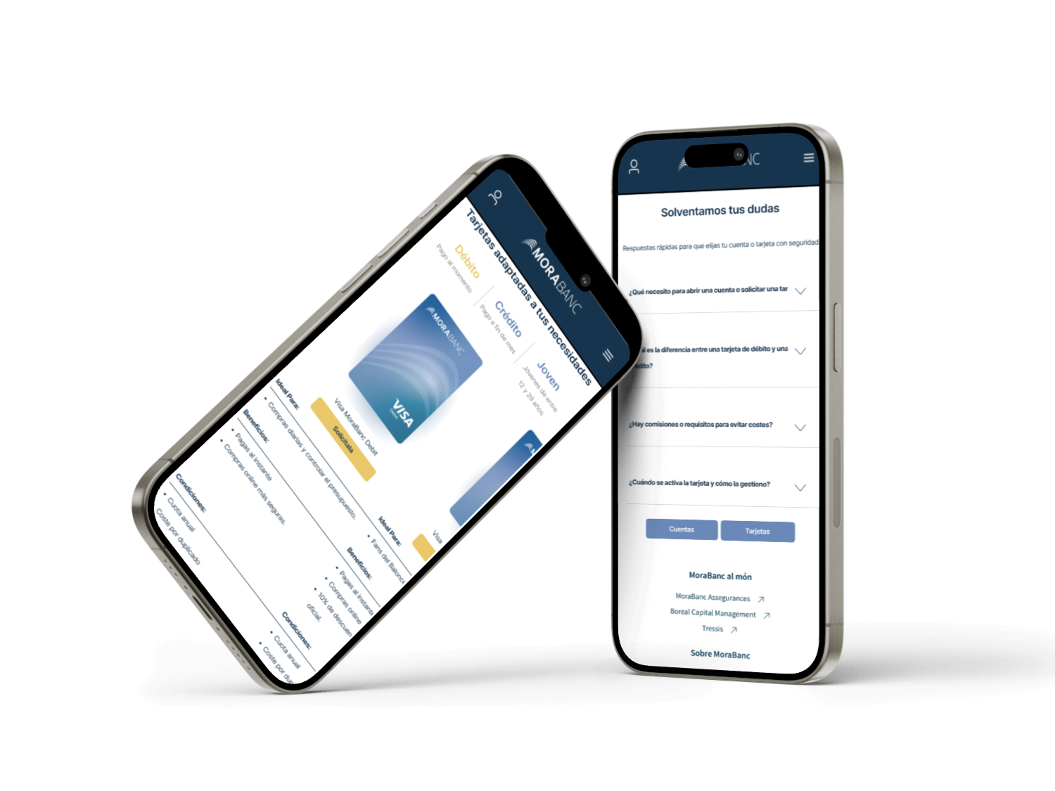
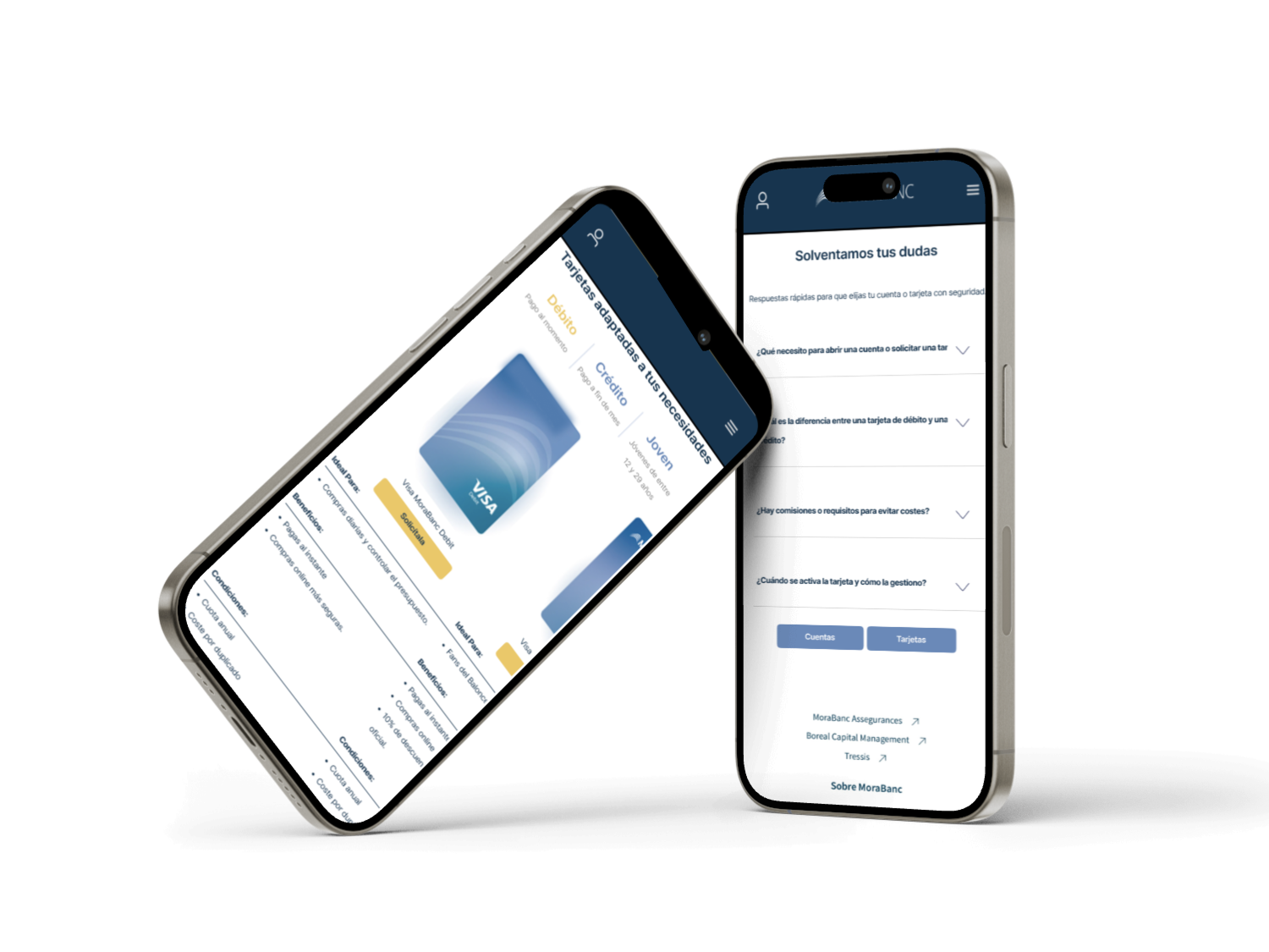
Confidence at the right moment
FAQ and reassurance placed before the final CTA
Common objections resolved without breaking the flow
Consistent CTAs to avoid doubt about the next step
Validation & success criteria
-
Hypotheses
Users understand categories faster
Comparison requires less effort
Users reach “Apply” with fewer doubts
-
Proposed validation
Moderated usability testing with comparison tasks
Time-to-decision measurement
Confidence rating before starting application
-
Success indicators
Faster time to first meaningful action
Reduced back-and-forth between products
Higher confidence reported before conversion
Outcome
This case demonstrates how research-led strategy and structured decision design can reduce complexity in high-trust environments.
Rather than adding features or content, the solution focuses on:
Making differences explicit
Reducing unnecessary choice
Guiding users toward confident action
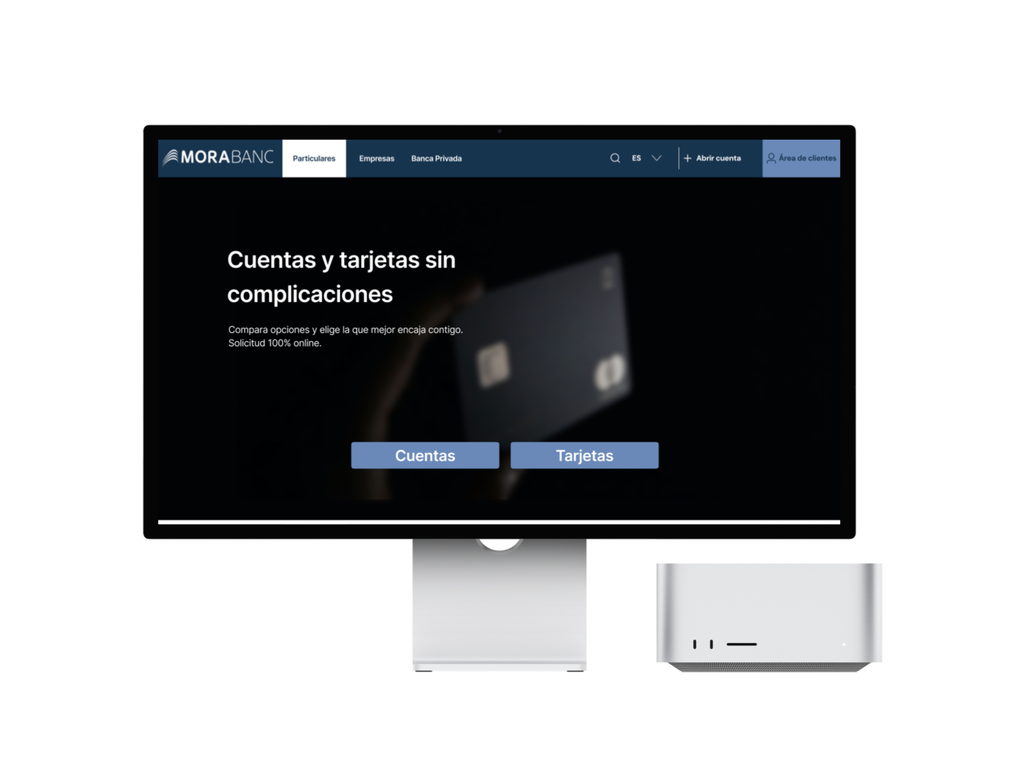
Prototype
The prototype was created to validate structure, hierarchy, and decision flow — not to define final visual design.
It focuses on: Understanding the offer at a glance, Comparing options without memorization, Reaching a clear next step with confidence